Bridagency
A bilingual (DE/EN) wedding-vendor platform for couples who don't want to compare dozens of portfolios cold. A 23-step planning wizard turns their style, guest count, timeline and budget into matched service recommendations — the budget splits proportionally across whatever they choose, and stays adjustable afterward.
My scope: UX research (thinking-aloud testing, a written survey), the planning wizard's interaction design, and the full-stack build — Astro, Solid, and the Node backend.
30-SECOND PROJECT READ
The project at a glance.
- Challenge
- Help couples compare wedding services and plan a budget without opening dozens of supplier pages.
- My role
- UX research, interaction design and full-stack implementation of the bilingual planning experience.
- Team
- Independent product work, tested with prospective users.
- Timeline
- Product platform · 2026
- What shipped
- A bilingual vendor platform and adjustable 23-step planning wizard with proportional budget allocation.
- Outcome
- 24 thinking-aloud sessions and 15 written replies shaped the flow; production smoke tests caught real state and mobile defects before launch.
Endless portfolios, no clearer
Couples planning a wedding don't lack vendor options — they're drowning in them. Bridagency's own homepage names the actual problem directly, rather than pitching another directory to scroll through.
“If you do not want to keep comparing dozens of portfolios only to feel even less sure, this is a better place to start.”
Bridagency homepage copyWhat 24 sessions and 15 written replies actually said
Thinking-aloud testing across the wizard and the service guide pages, backed by a written survey — not assuming what people wanted.
Sessions run
Across the planning wizard and the service guide pages.
Named visuals as the main decision factor
Of the 15 written replies — the strongest single signal in the data.
Wanted more explanation before choosing
Not more options — more context for the options already there.
Uncertainty became an entry point, not a dead end
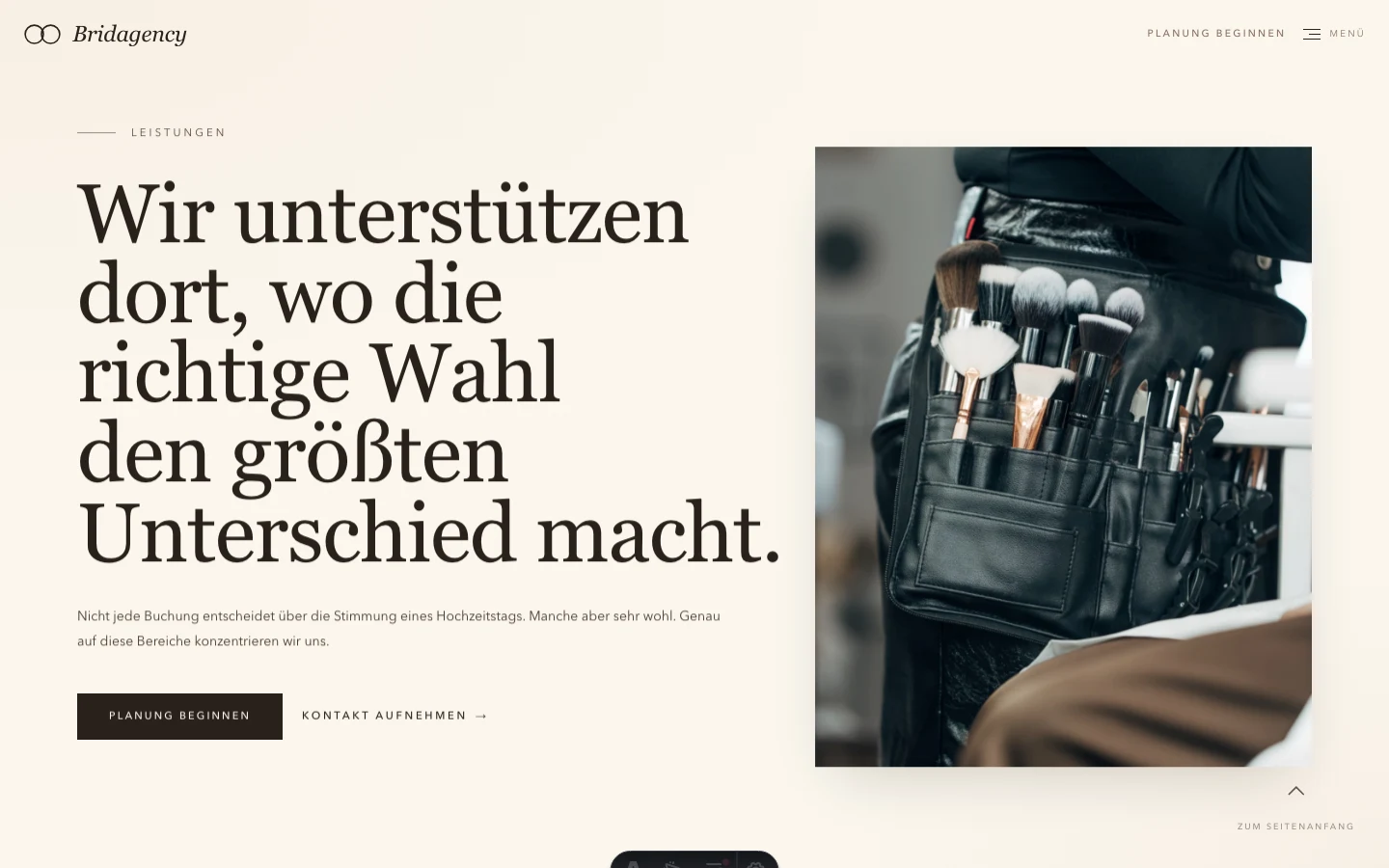
The wizard splits into two entry modes: a full planning walkthrough, or a direct jump to one service, because couples arrive with wildly different amounts of certainty. Change the overall budget and each service's share adjusts to it, keeping the relative weight you'd already set rather than resetting to even splits.
“Uncertainty turned out to be valid input, not a problem to eliminate.”
Design note, Bridagency planning wizardThe interface, wired straight to its code
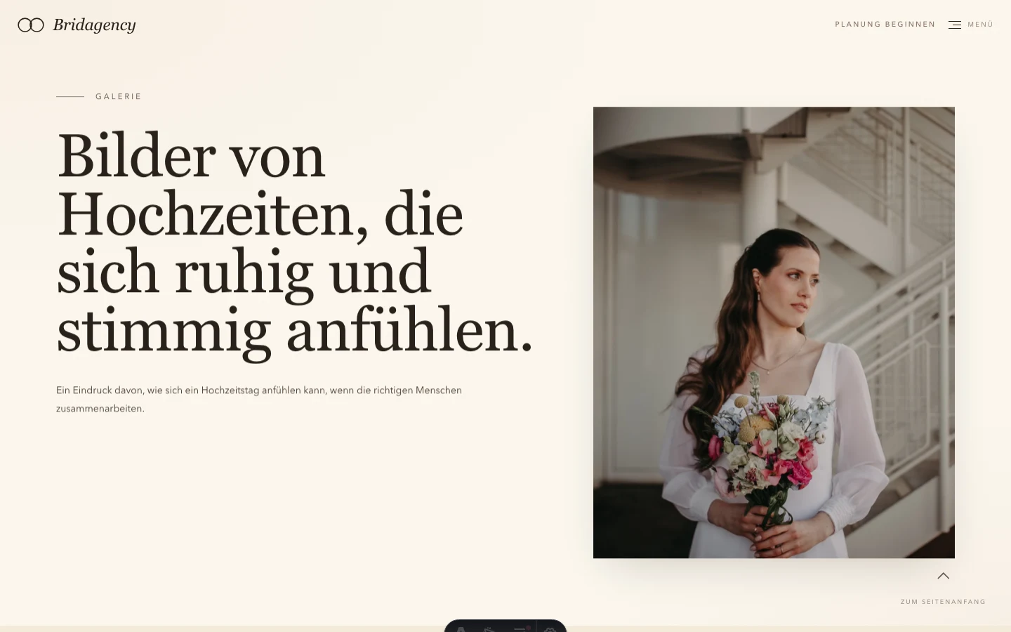
Real screens from the live build, annotated at the actual logic behind them — pulled straight from the repo.
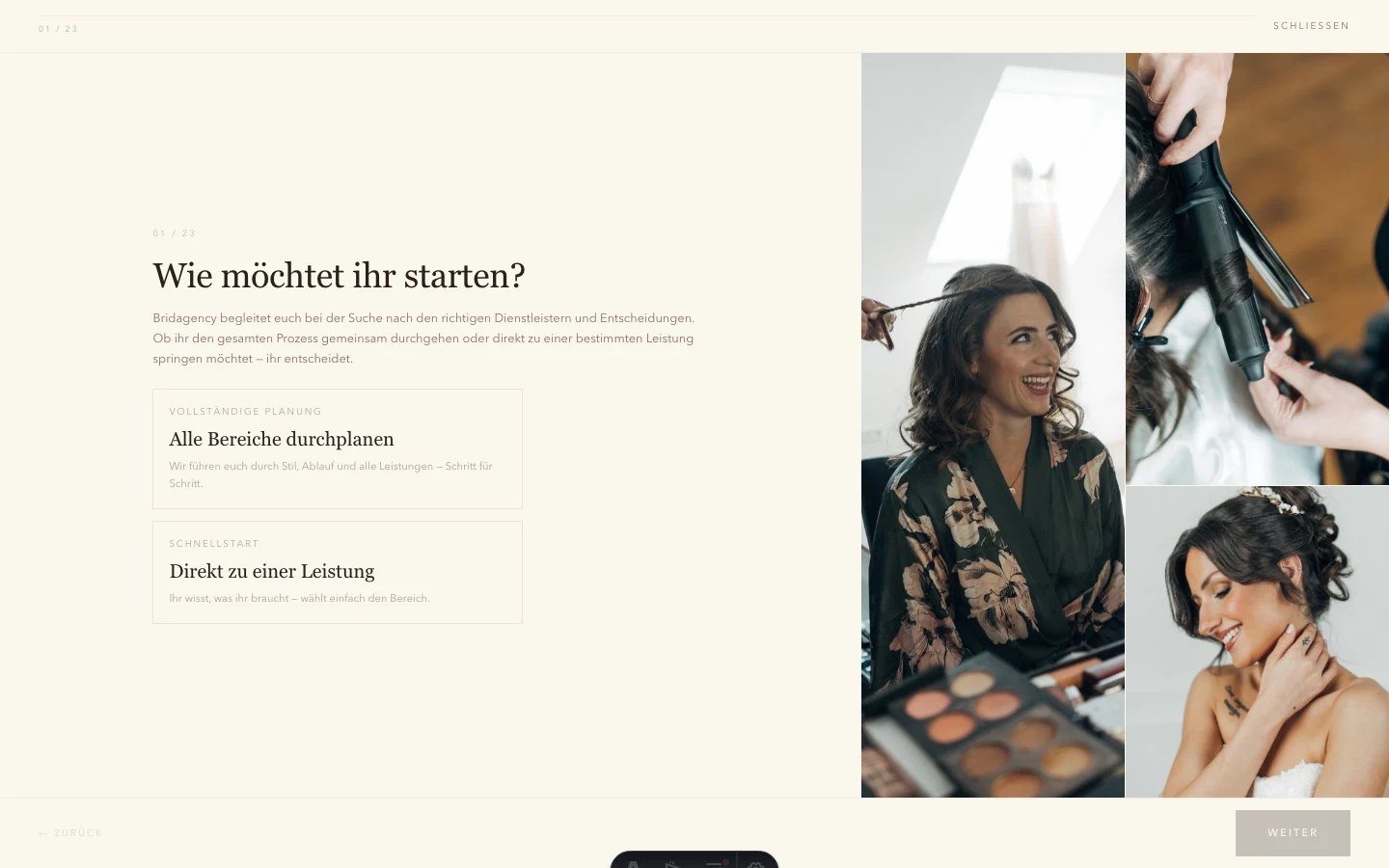
Real bugs, found before launch
A Playwright smoke suite runs the actual planner flows — not just a build check.
Duplicate images in the intro collage
The same photo could appear twice in the opening collage — caught by a visual smoke test, not someone scrolling past it.
Stale draft leaking into quick-start
See the annotated screen above — a real state-management bug between the two entry modes.
Mobile horizontal overflow
The wizard could scroll sideways on small screens — a layout bug no desktop-only QA pass would have surfaced.
What actually shipped
Astro 6 for the static/editorial pages (service guides, gallery, legal), with a single Solid island carrying all the stateful planning logic. Astro i18n routes German and English as separate trees. Contact and planning submissions go through Astro Actions to a Node server, emailed via Resend. Deployed on Coolify.
Small sample, honest signal
15 written replies and 24 thinking-aloud sessions — a small, real sample, not a statistically representative one. Treated as directional, not proof: the reason the guide pages got more explanatory copy and the service pages got more imagery, not a claim about all couples using the site.
What I would do differently
Test the quick-start path as hard as the full one
Most of the early testing focused on the full 23-step flow — the stale-draft bug only surfaced once quick-start got equal attention.
Ship the guide pages before the wizard, not after
Couples read the service guides to decide whether to trust the wizard at all — sequencing them second undersold that.
The written survey is 15 replies — real, but small. The 86% / 67% figures describe this sample, not a claim about all couples using the site.
More thinking-aloud rounds specifically on the quick-start path — it got the least attention early on, and the one bug that shipped anyway (the stale-draft leak) came from that gap.