Plox
A full social platform for pixel artists: a public gallery, competitive challenges, leaderboards, sharing, moderation, and a real creative canvas — designed as one connected product rather than a collection of generic screens.
My scope: full-stack product design and development across the public discovery surface, the React studio workspace, shared product architecture, and the interaction model connecting both.
30-SECOND PROJECT READ
The project at a glance.
- Challenge
- Combine a public creative community with a capable pixel-art studio without making the first-use experience feel like a cockpit.
- My role
- Product design and full-stack development across discovery, creation, sharing, moderation and the studio interaction model.
- Team
- Independent product design and build.
- Timeline
- Web application · 2025
- What shipped
- A connected social platform with galleries, challenges, profiles, guides, moderation and a working creative canvas.
- Outcome
- The gallery, challenges, profiles, moderation tools and browser-based editor are working. The case study labels the measurements that still need to be collected.
How do you make a serious creative tool feel approachable?
Plox had to serve two very different moments: discovering other artists and working inside a dense pixel-art studio. The product needed gallery discovery, social motivation, and a capable canvas without making the first interaction feel like opening a cockpit.
“The first question was not “what framework?” It was “how do pixel artists discover each other?””
Plox process notesOne product, two surfaces, one interaction model
Plox separates the public, SEO-first surface from the no-index creative studio. That separation protects the focused workspace while keeping artworks discoverable, shareable, and connected to a community layer.
Discover and share
A server-rendered gallery, animated previews, artist profiles, challenges, leaderboards, and short-code sharing make the work visible beyond the editor.
Create without distraction
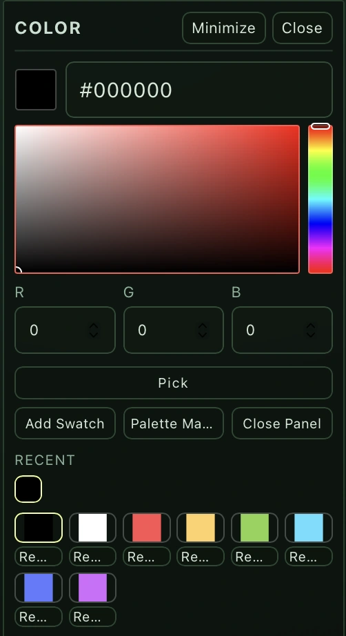
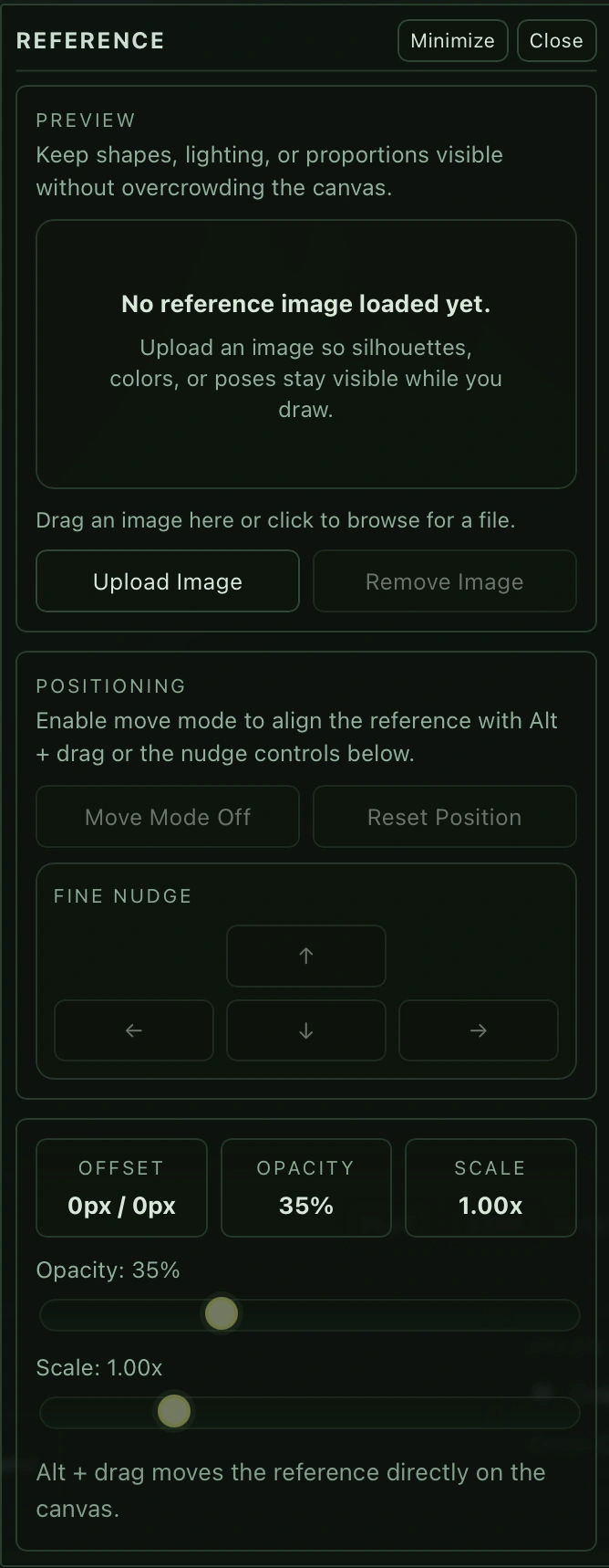
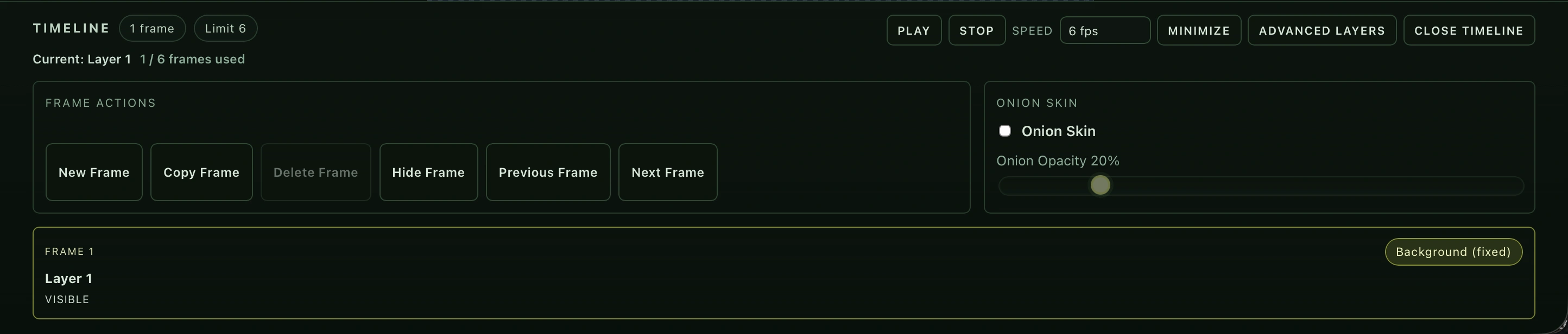
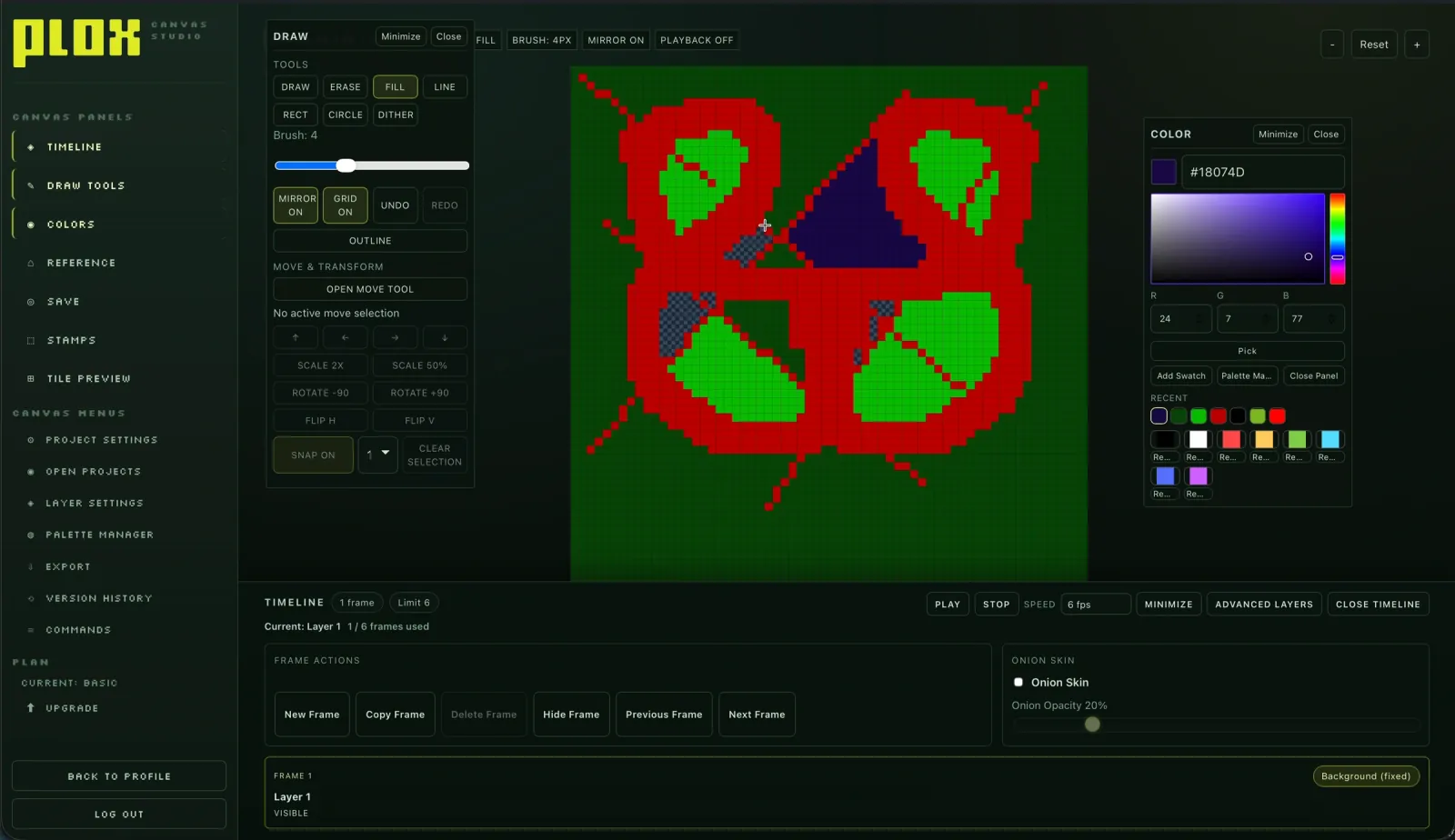
The React canvas keeps drawing, colour, references, layers, frames, onion skinning, and project state close to the work itself.
Connect through one API
A shared type system and Express API keep identity, artwork lineage, challenges, permissions, and moderation consistent across both surfaces.
Complexity organised, not erased
A creative tool cannot hide every advanced capability. The goal was to give beginners a visible route into the product while preserving accelerators for people who already know how they work. Dedicated panels support recognition; shortcuts and a command palette support speed.
The interface was only one part of the work
Plox runs as a full-stack monorepo: Next.js for the public surface, React for the studio, Node and Express for the shared API, Supabase (Postgres) for product data, and Docker Compose for the local stack. Caddy routes the public site, studio, and API as separate services without splitting the product model apart.
“One command spins up the full stack. Each surface can evolve independently without breaking the other.”
Plox process notes · local deployment architectureWhere product, interface, and infrastructure meet
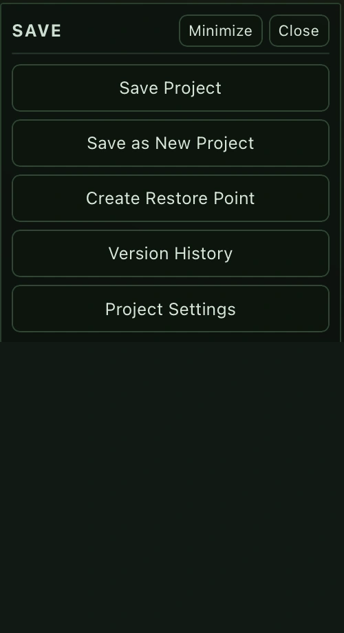
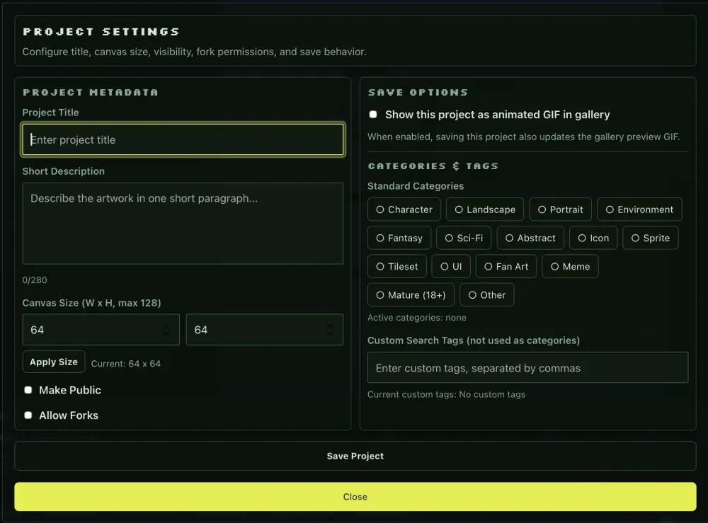
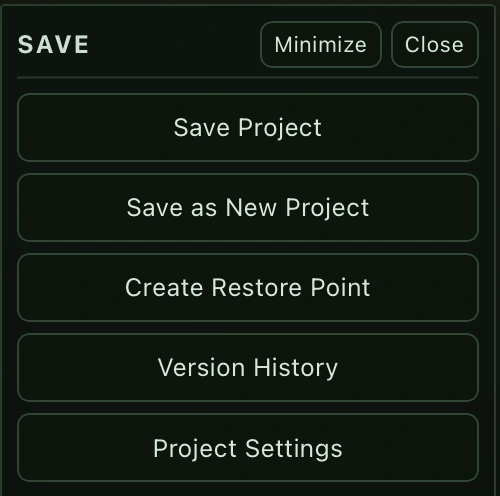
The implementation crosses product, interface, and infrastructure decisions: workspace state, frame operations, save flow, reference controls, and the boundaries between the public surface and the studio.
What I would measure before calling it easy
The engineering baseline is useful context, not a usability result. The next layer is a task audit: can a new user create, correct, animate, and share work without needing a tour?
Immediate feedback
Benchmark brush stroke, tool change, frame change, and undo latency. The research target is feedback beginning within roughly 100 ms — not a claim that Plox already achieves it.
Recovery by default
Check delete frame, delete layer, clear canvas, overwrite, unsaved work, undo, and redo for reversibility, confirmation, and visible state feedback.
Novice → expert path
Test first artwork, colour change, layer creation, undo, second animation frame, onion skin, and export with task time, errors, assistance, and confidence recorded.
The challenge was keeping the whole thing coherent
“Designing one screen was not the challenge. Maintaining a coherent interaction model across a growing creative ecosystem was.”
Case-study framing · engineering scale is context, not usability proofThe current project notes also report 240 passing app tests. These figures communicate system scale and implementation discipline; they do not replace task success data from real users.
Power needs a clear way in
Design the path, not just the panel
The key question was how discovery, creation, feedback, and sharing reinforce one another — not how to decorate a canvas.
Separate surfaces by user intent
A public gallery and a focused studio can share an API and product language without sharing the same density or navigation.
Treat shortcuts as a second layer
Expert efficiency should be available without making the first-use experience depend on memory or documentation.
The supplied project material gives us strong architecture and interaction evidence, but not yet a defensible task-success study or measured latency baseline. Those should be added once the final recordings and audit data are available.
Benchmark the four critical interactions, run a small task-based usability study, and turn the results into the page’s strongest proof instead of relying on feature count.