Beneath
A research-led mobile AR experience that translates accounts of depression into three spatial scenes — Overwhelmed, Numb, and Harm — so people can encounter what often remains hidden beneath the surface.
Seven-person university team · Contribution: research synthesis, experience strategy, interaction and UI design, visual direction, prototyping, and evaluation.
30-SECOND PROJECT READ
The project at a glance.
- Challenge
- Translate first-person accounts of depression into a spatial experience without turning emotional intensity into spectacle.
- My role
- Research synthesis, experience strategy, interaction and UI design, visual direction, prototyping and evaluation.
- Team
- Seven-person university team.
- Timeline
- Mobile AR project · 2024
- What shipped
- Three connected AR scenes with an interaction layer, safety affordances and a complete mobile journey.
- Outcome
- The first usability test changed the interface and scene structure; the iteration lifted every reported UEQ-S median.
Design system
Three AR scenes share a mobile interaction flow. Recurring controls and safety functions help people move between scenes.
Working with stakeholders
I worked in a seven-person university team. Interviews, a survey and usability tests included people with lived experience of depression and people without that experience.
Start with people, not a dramatic effect
The project began with interviews and a survey of 280 people: 130 who did not identify as affected, 83 who described an undiagnosed depression, and 67 with a diagnosis. That mix gave the team two perspectives to design between — lived experience and the understanding of people the experience was meant to reach.
“The experience was not meant to explain depression from the outside. It had to translate recurring accounts into something spatial, situated, and felt.”
Research framing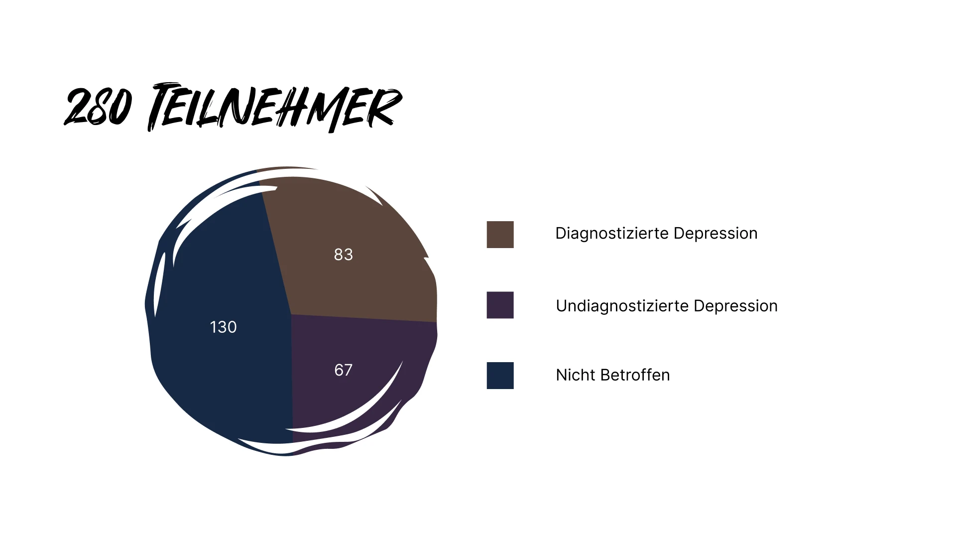
The pattern was bigger than sadness
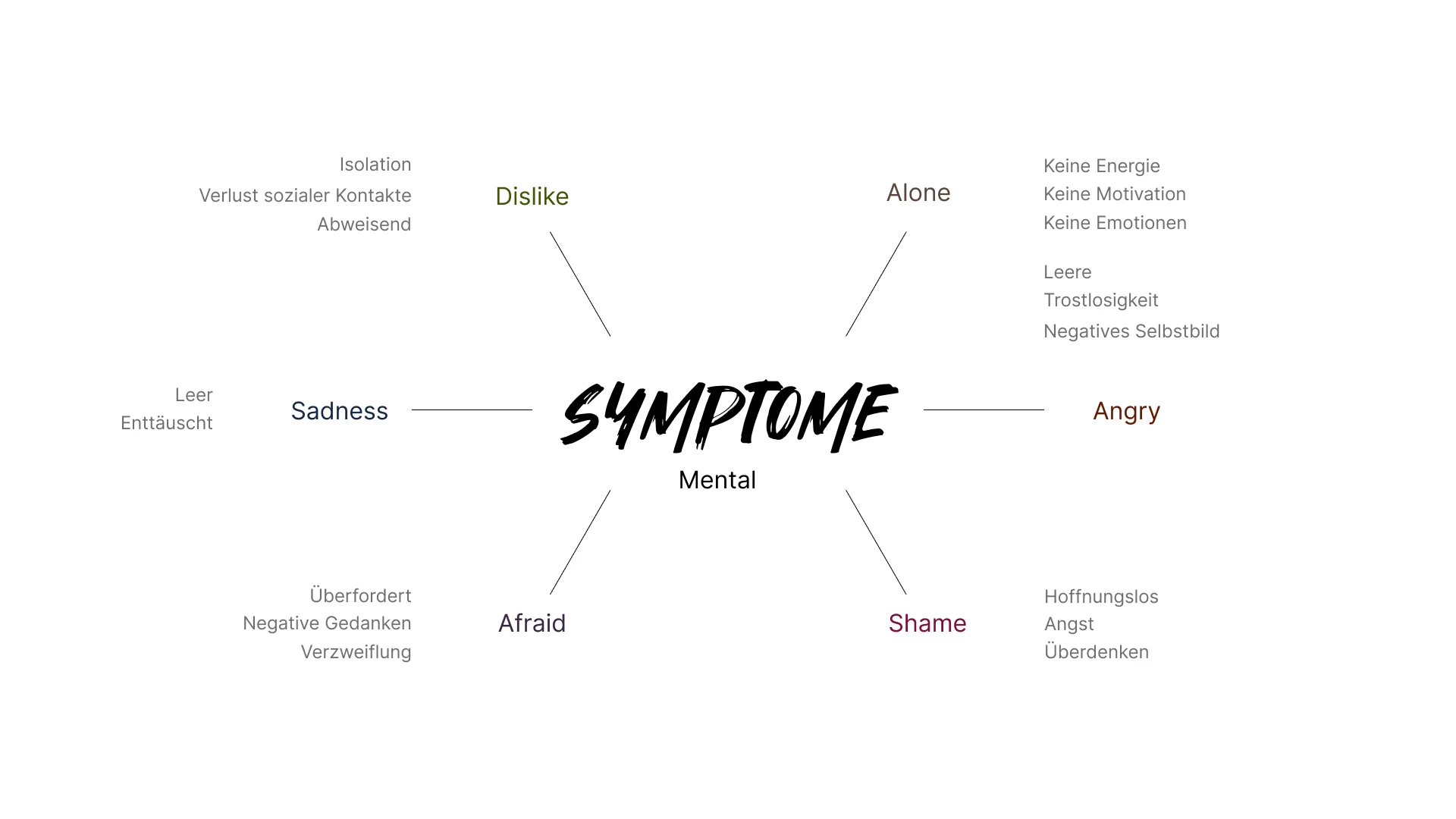
The research clustered around mental, social, and physical effects: emptiness, overthinking, anxiety, hopelessness, isolation, loss of contact, exhaustion, disrupted sleep, neglect, and harm. That breadth became a strategic constraint: one generic “sad” scene would flatten the experience, so the product needed distinct situations with different interaction rules.
Thoughts turn inward
Overthinking, fear, shame, hopelessness, low motivation, and a negative self-image repeatedly shaped the inner experience.
Everyday contact becomes difficult
Withdrawal, isolation, rejection, and the loss of social contact showed how depression changes ordinary relationships — not only mood.
The body carries it too
Fatigue, appetite loss, disrupted sleep, neglect, pressure, aggression, and self-harm made a purely visual metaphor insufficient.
Turn three patterns into three scene behaviours
Instead of treating AR as a layer of spectacle, each scene paired one research theme with a different degree of agency. Interaction was used where it clarified the pattern — and withheld where control would have contradicted it.
A thought stream that keeps growing
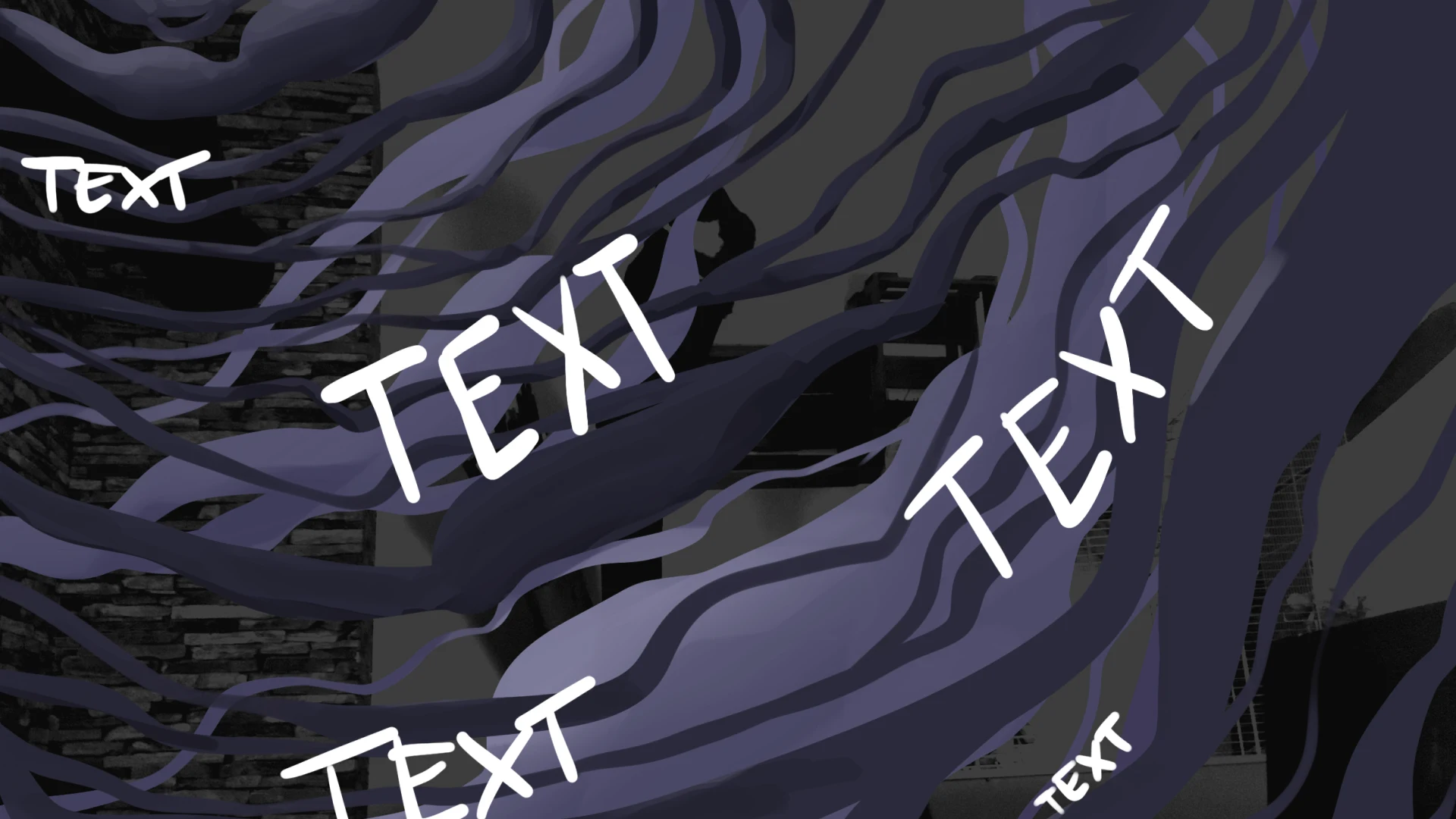
A black liquid and circling text create the feeling of drowning in overanalysis. Participants can add a thought of their own, making accumulation the interaction itself.
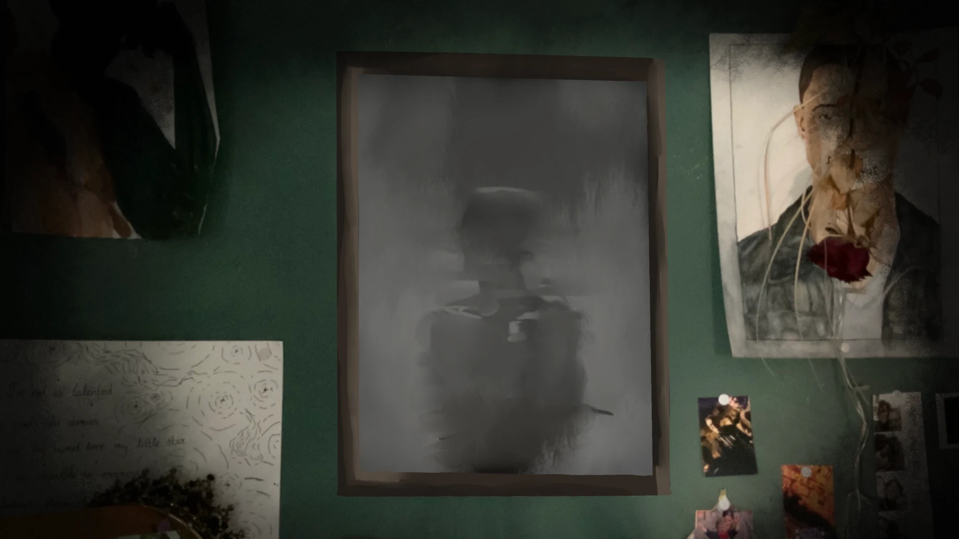
A mirror that will not respond
A poster opens onto an obscured reflection and a hidden room. The scene is intentionally non-interactive: the inability to change it is part of the meaning.
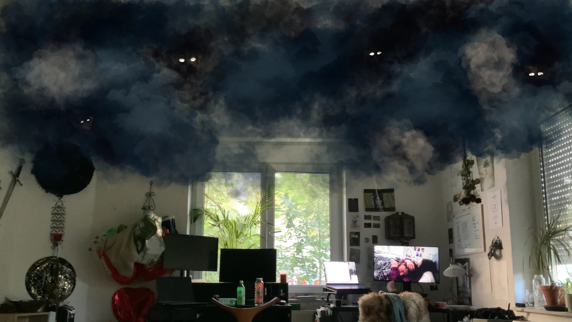
A cloud inside an ordinary chat
A branching conversation turns self-sabotage and withdrawal into everyday choices. The cloud grows or recedes with each response rather than appearing as a detached symbol.
Give every metaphor a technical rule
The metaphors became concrete prototypes rather than moodboards. Overwhelmed used an image target, a distortion shader, sound, and text input. Numb combined an image target, depth mapping, character animation, subtitles, and a hidden room. Harm used a branching chat, a reactive cloud, blinking eyes, and a mirrored ground plane that placed the effect on the ceiling.
“The technology was chosen after the emotional mechanic: target, shader, sound, and branching logic each had a job in the experience.”
Prototype strategy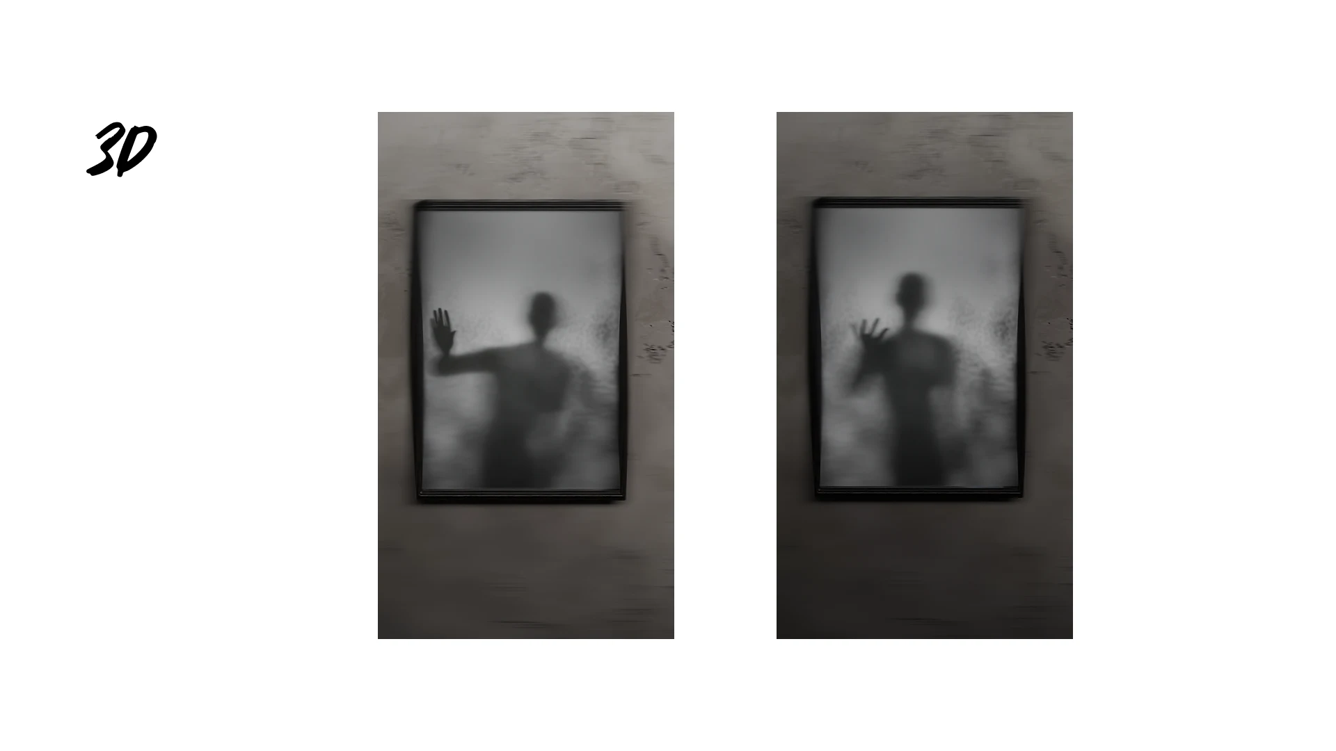
Content warnings and ways to leave a scene
The surrounding product flow was as important as the AR scenes. A trigger warning set expectations; a goal and how-to sequence explained what would happen; persistent navigation made it possible to leave; and the menu connected people to information about depression, personal stories, and support resources. In-scene copy and confirmation states kept the interaction legible while attention was split between screen and space.
“For sensitive content, orientation, exit, and aftercare are core product behaviour — not a disclaimer added at the end.”
Interface principle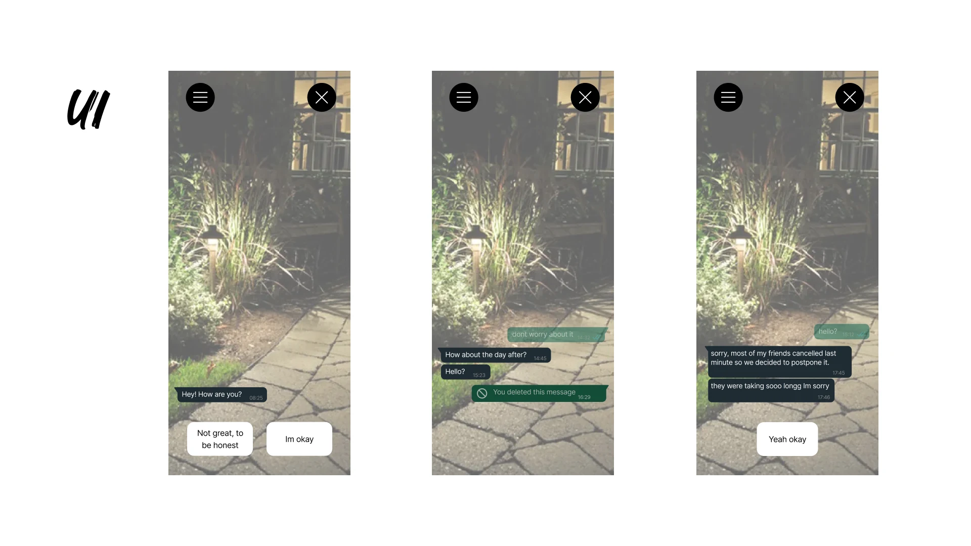
The first test changed the product
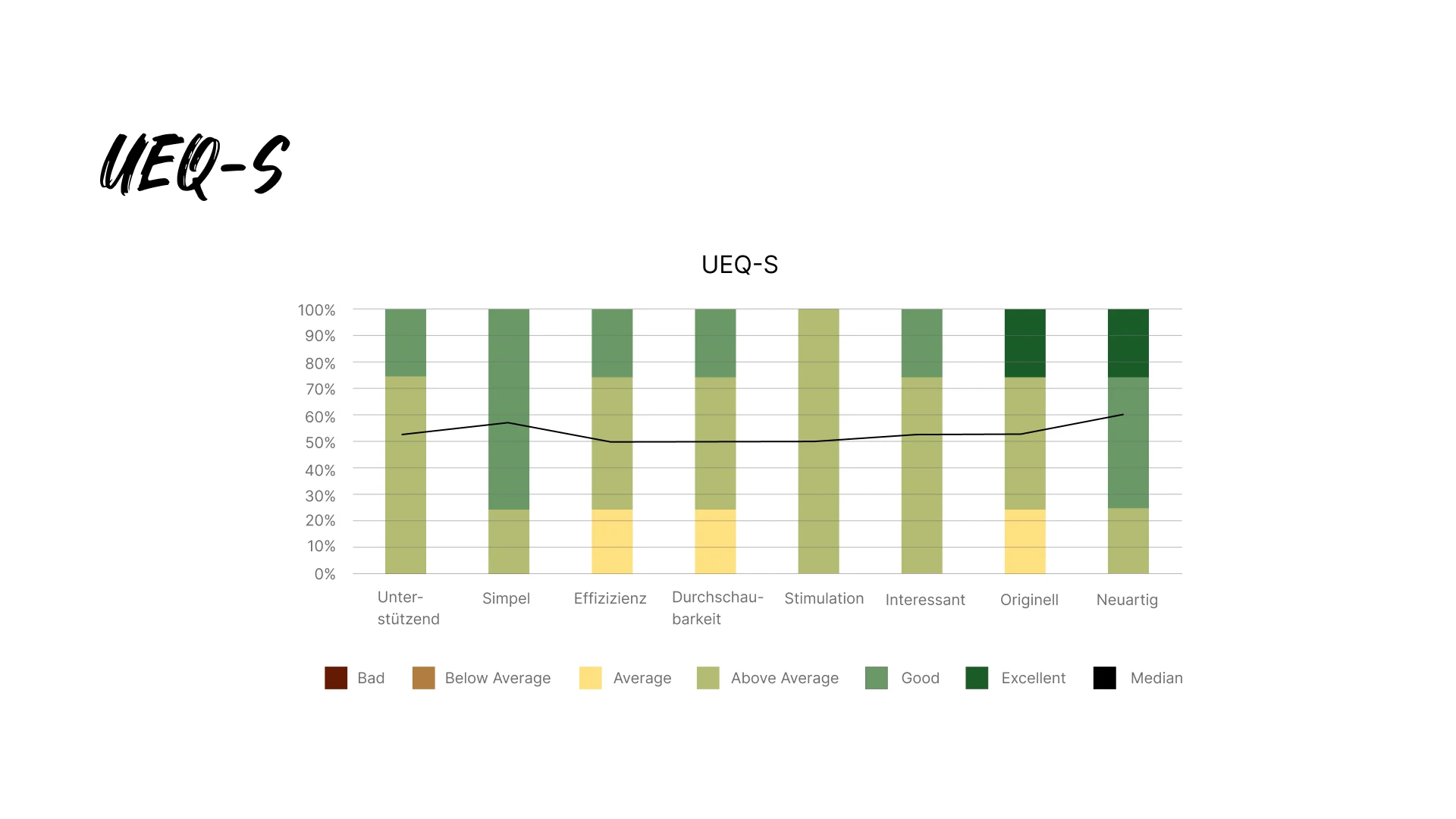
The first prototype was evaluated with the UEQ-S, a short standard user-experience questionnaire, and qualitative feedback. Participants responded positively to the sound, visual design, spoken material, the ability to add sentences, and the insight into a depressive inner world. They also exposed the product work still missing: clearer onboarding, more understandable UI, feedback after sending text, more scene interaction, and bug fixes.
The emotional system worked
Sound, visuals, voice, and participatory text produced the intended feelings of stress, fear, and overwhelm without relying on exposition alone.
The interface competed with the scene
The UI needed clearer instructions, responsive states, explicit confirmation after input, simpler entry, and fixes for the tornado and music controls.
One scene was not enough
The next iteration rebuilt the first scene, added the two poster-based scenes, revised menu copy and navigation, and treated sound as part of the full sequence.
Iteration lifted every UEQ-S median
“The second round did not just look better: every UEQ-S median moved upward after the product changes.”
Test round 1 → test round 2Percentages convert the project’s five-point custom-question scores for a shared visual scale. These results measure participant ratings of the prototype; they do not establish a clinical outcome or a universal representation of depression.
Navigation between the three AR scenes
Invite participation without forcing it
The Overwhelmed scene lets people contribute a thought, while the Numb scene deliberately removes control. Agency follows the idea instead of a single interaction pattern.
Keep escape and support within reach
A persistent menu links the scene back to context, personal stories, help resources, and a clear return path.
Test understanding, not intensity alone
A powerful reaction is not automatically empathy. Pairing UEQ-S with questions about represented feelings and understanding made the evaluation more useful.
Research could be translated into distinct spatial metaphors, and concrete UI, sound, and interaction changes improved how participants rated the experience across two rounds of testing.
Beneath is an interpretive prototype, not a simulation of every depressive experience. A next version should deepen co-design with people who have lived experience and mental-health expertise, then evaluate safety and longer-term understanding beyond the session itself.